
If you’ve ever stood in a paint aisle holding five nearly identical beige swatches and thought, why is this so stressful? — welcome to the club. Choosing colours sounds fun and aesthetic until your living room suddenly feels like a waiting area at a dentist’s office. This is exactly where Warm vs Cool Colours come in. Understanding the difference (and how to use them properly) can completely change how your home feels, not just how it looks.
In this Home Flow guide, we’re breaking down Warm vs Cool Colours room by room — softly, stylishly, and without turning this into an Interior Design degree. Think curated inspiration, gentle guidance, and a few “ohhh that makes sense” moments.
What Are Warm vs Cool Colours? (A Quick, No-Fluff Breakdown)
Let’s keep this cute and simple.
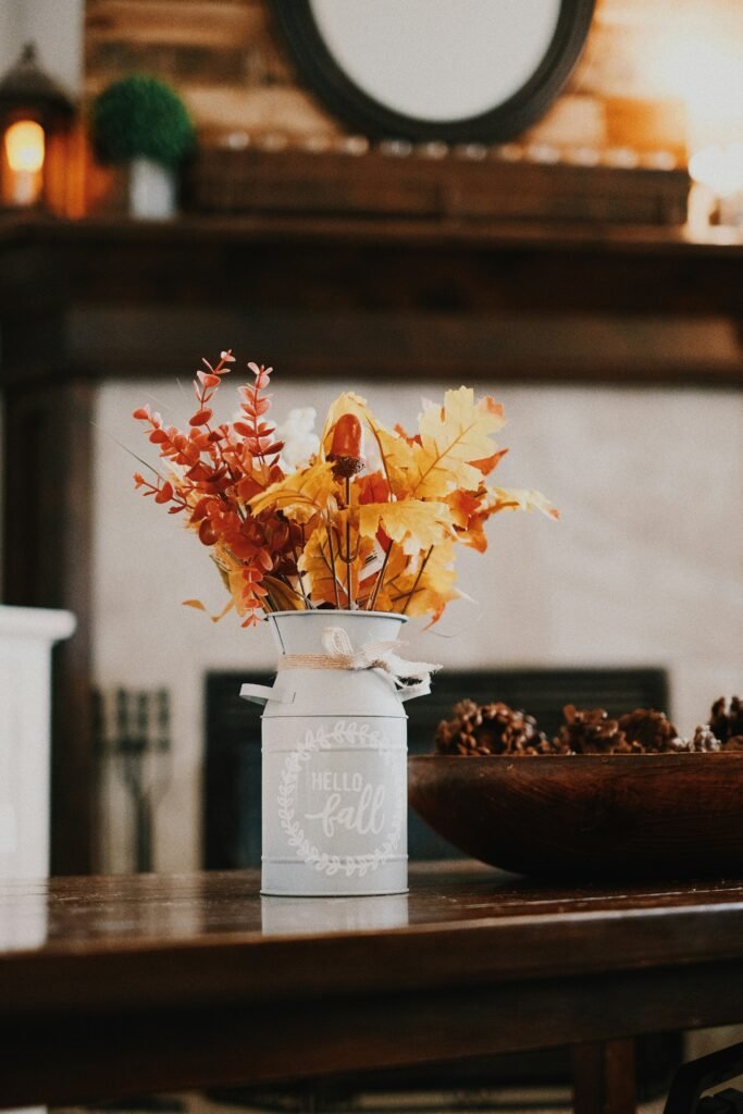
Warm colours include shades with red, orange, or yellow undertones — think terracotta, beige, warm whites, caramel browns, blush, and soft olive. They feel cosy, inviting, and lived-in.
Cool colours lean towards blue, green, and purple undertones — like sage, grey, icy whites, navy, and soft blues. These feel calm, airy, and refreshing.
The magic of Colours isn’t about picking one forever. It’s about knowing where each works best.
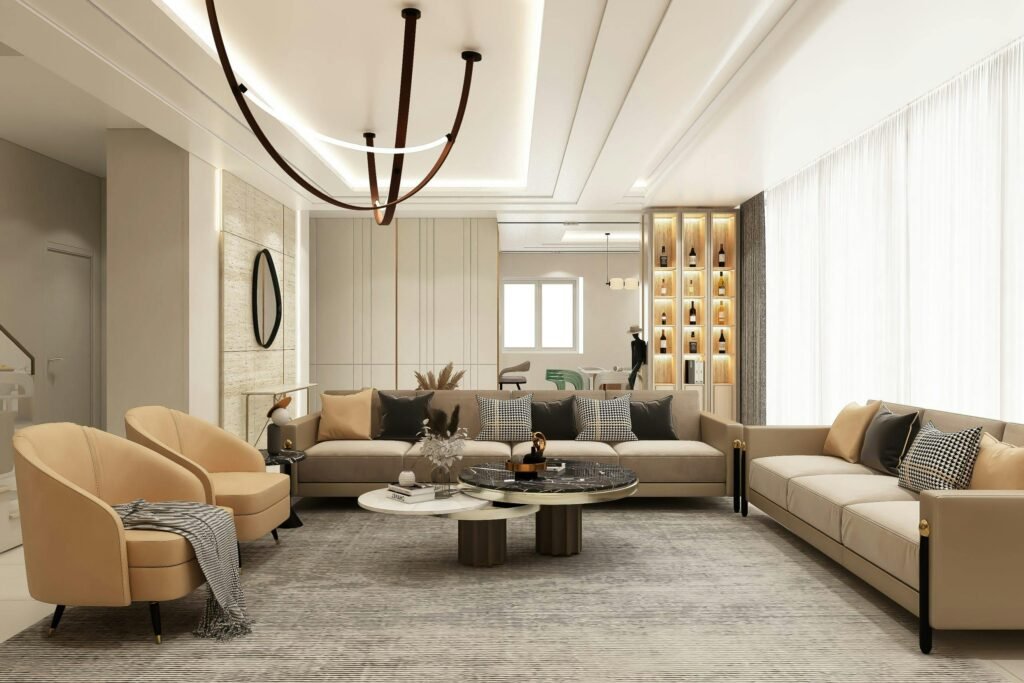
Living Room: Warm vs Cool Colours for Everyday Comfort
Your living room is where life actually happens — naps, guests, deep chats, and doom-scrolling.
Warm tones work best here because they instantly feel welcoming. Soft taupes, creamy whites, warm greige, and muted earthy tones create that “sit down, stay awhile” energy.
If you love a cooler palette, balance it with warmth through textures — a linen sofa, wooden furniture, or warm-toned cushions.
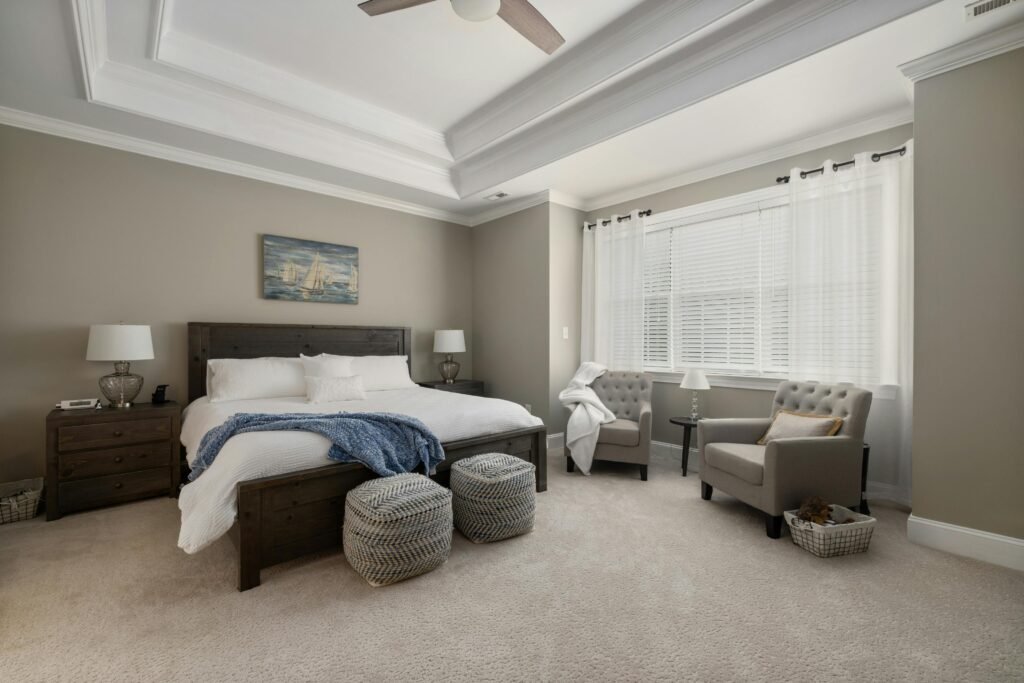
Bedroom: Colours for Restful Sleep
When it comes to the bedroom, Colours becomes very personal.
Cool colours like sage green, dusty blue, or soft grey are incredible for calming the nervous system. They visually recede, making the room feel more spacious and serene — ideal if your brain doesn’t know how to switch off.
That said, overly cool rooms can feel a bit hotel-ish. Layer in warmth with soft lighting, wooden bedside tables, or warm textiles.
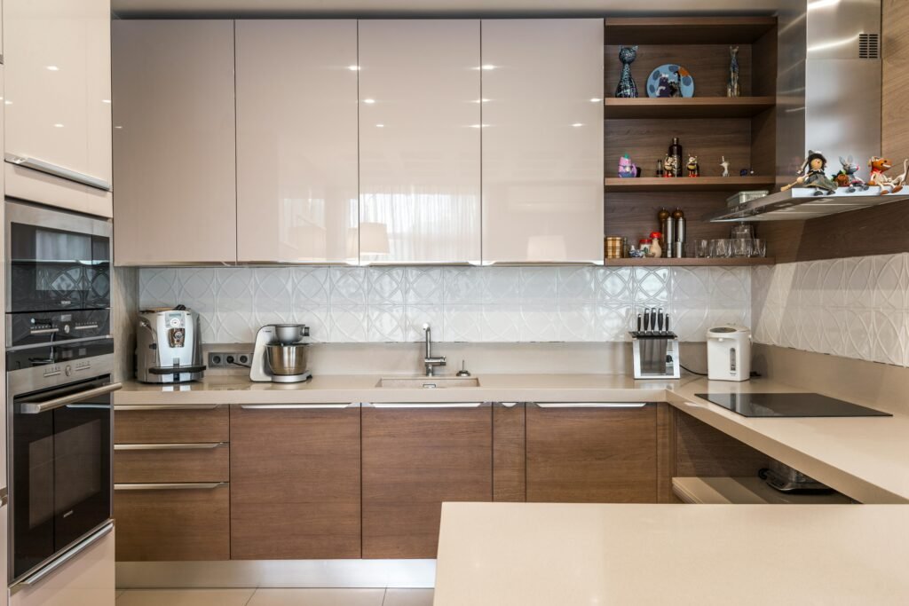
Kitchen: Warm vs Cool Colours for Energy and Flow
Kitchens are social, energetic spaces — even if you’re just making toast.
Warm colours like creamy whites, warm greys, soft beige, or muted clay tones help kitchens feel inviting and lived-in. They’re especially gorgeous in homes with natural wood finishes.
Cool colours can work — especially soft blues or greens — but they shine best in light-filled kitchens with lots of warmth elsewhere.
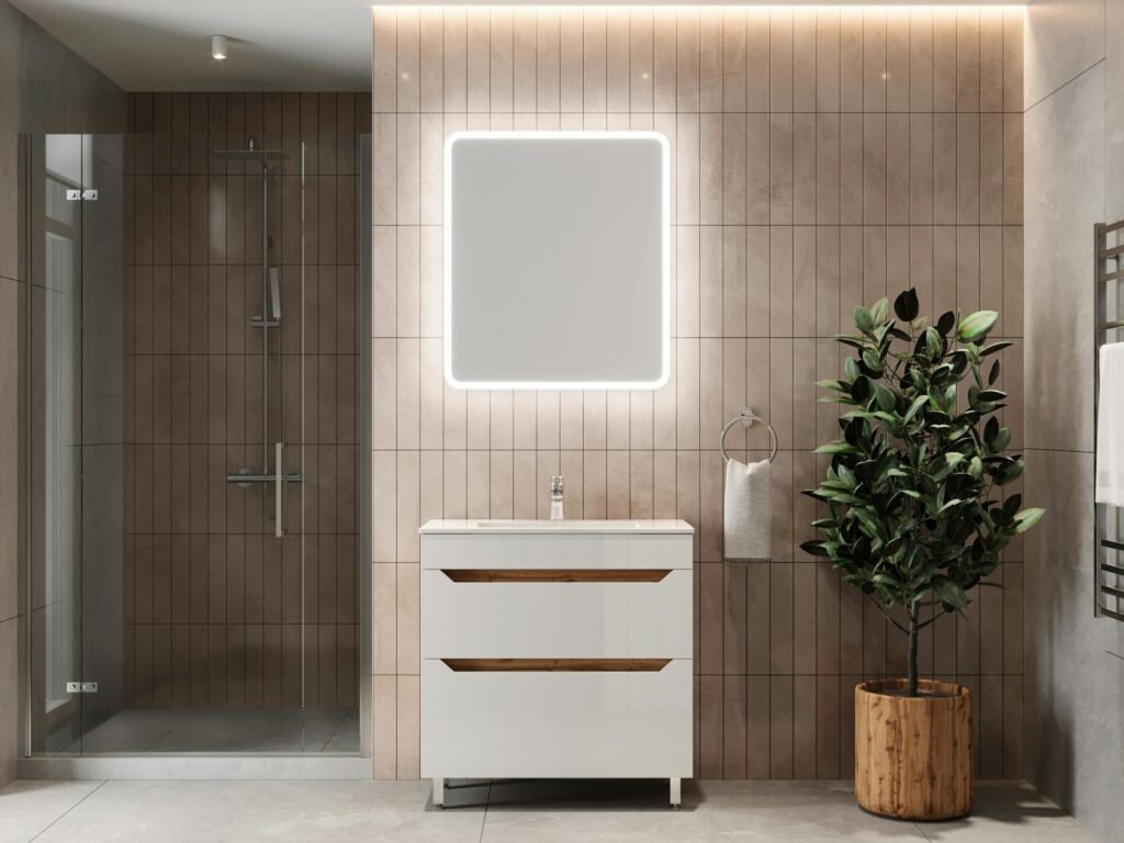
Bathroom: Warm vs Cool Colours for Freshness
Bathrooms are where cool colours truly shine.
Soft blues, pale greys, sage greens, and crisp cool whites instantly feel clean and spa-like. These tones reflect light well, which is perfect for smaller bathrooms.
If cool feels too stark, add warmth through brass taps, wooden stools, or woven accessories. Balance is the whole point of Warm vs Cool Colours, after all.
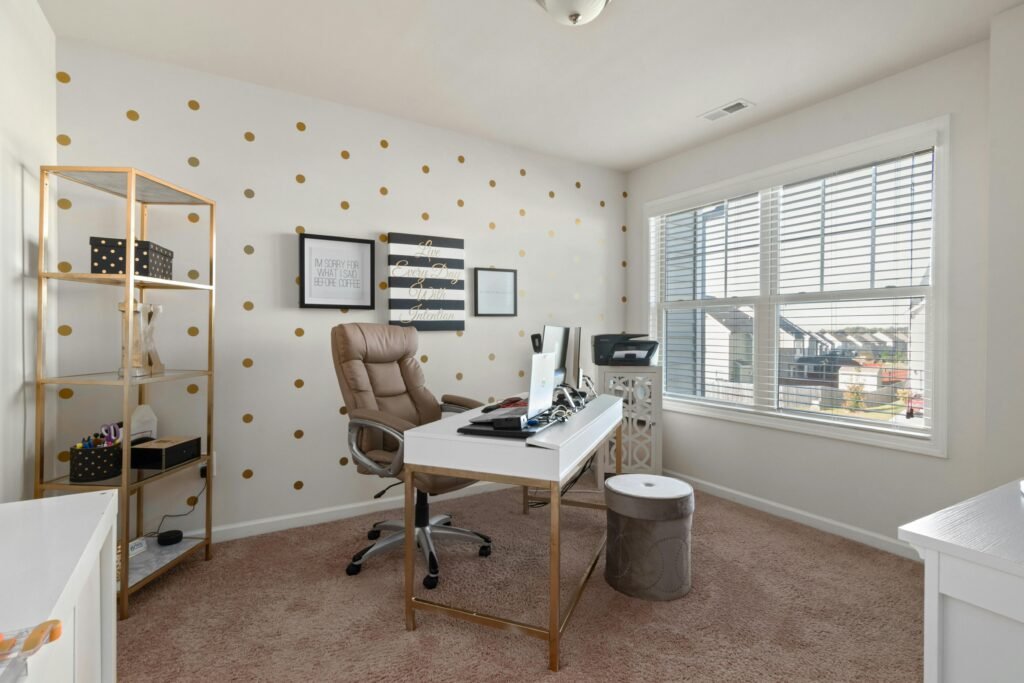
Home Office: Warm vs Cool Colours for Focus
Your home office needs to support productivity without draining you.
Cool colours like soft green or blue improve concentration and reduce visual noise — perfect if you’re staring at a screen all day.
However, too cool can feel sterile, so sneak in warmth through lighting, desks, or artwork.
Entryway & Hallways: First Impressions Matter
These spaces are often overlooked, but they set the tone.
Warm colours work beautifully here — they make a home feel instantly welcoming. Soft beige, warm white, or muted earthy tones help create flow between rooms.
Final Thoughts on Warm vs Cool Colours
The key takeaway from Warm vs Cool Colours isn’t rules — it’s intention. Warm colours connect and comfort. Cool colours calm and refresh. The best homes blend both with ease.
If a space feels “off”, it’s often not the furniture — it’s the undertone doing you dirty.
Try this tip today: next time you’re choosing paint, hold the swatch next to wood, fabric, and lighting in the room. Undertones reveal themselves real quick.
If you loved this Home Flow guide, read the rest of the blog for more soft, stylish living tips that make your home feel like you.