Have you ever walked into a room and instantly felt either uplifted or… a little off? That subtle emotional tug often comes down to colour. Understanding colour theory in interior design can completely transform how a space feels—turning it from “meh” to “wow” without a full renovation. I’ve spent hours curating my own soft-flow spaces, experimenting with palettes that calm, energize, or inspire. And trust me, a little knowledge about colour theory goes a long way.
What is Colour Theory in Interior Design?
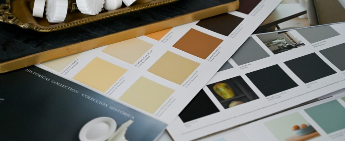
At its core, colour theory is about how colours interact, influence mood, and create balance in a space. Designers often start with the colour wheel, dividing shades into primary, secondary, and tertiary categories. But beyond the basics, it’s about knowing which tones complement each other, which clash, and how lighting affects perception.
For instance, a soft blush paired with muted greens can create a serene, spa-like vibe—perfect for bedrooms or cozy reading nooks.
Understanding Colour Families
Breaking down your palette into colour families makes decorating feel much easier. Here’s a soft-flow-friendly approach:
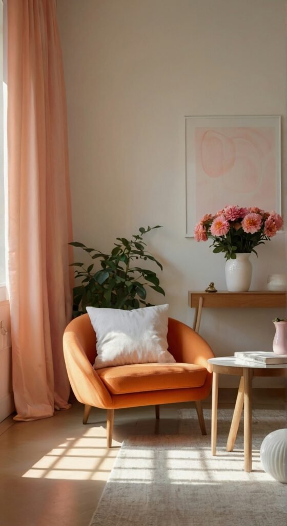
- Warm Tones: Think peach, coral, and buttery yellows. These shades feel inviting and energetic. Use them in living areas or kitchens to create a cheerful atmosphere.
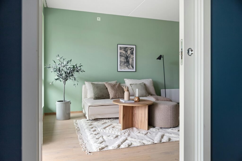
- Cool Tones: Soft blues, lavender, and sage greens have a calming effect, ideal for bedrooms, bathrooms, or home offices.
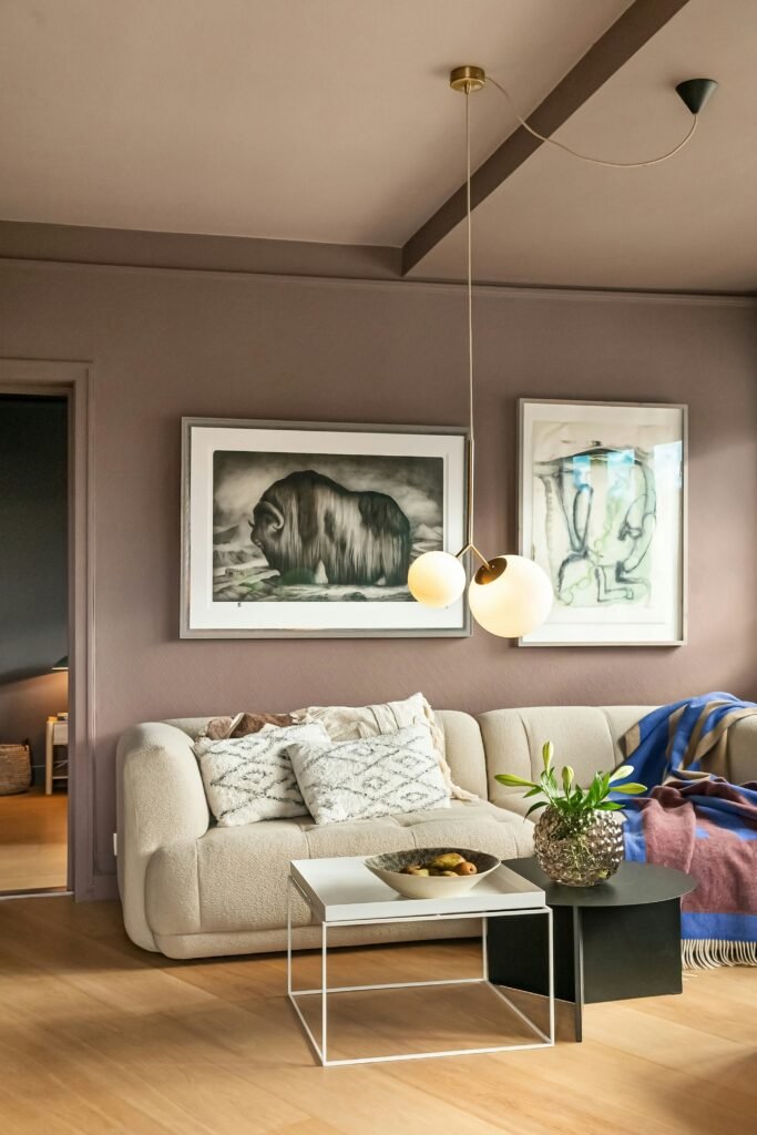
- Neutral Tones: Creams, taupes, and warm greys act as the perfect backdrop. Pair them with a pop of colour for depth.
The Psychology Behind Colour Choices
Colour isn’t just visual—it’s emotional. Knowing a few psychological rules can help you create intentional spaces:
- Blues & Greens: Relaxation, focus, and balance. Great for reading corners or study areas.
- Yellows & Oranges: Energy, optimism, and warmth. Ideal for kitchens or creative spaces.
- Pinks & Lavenders: Softness, romance, and calm energy. Perfect for bedrooms or personal lounges.
Creating Harmony With Complementary & Analogous Colours
Two key colour theory concepts can elevate your interiors without overthinking:
- Complementary Colours: These are opposites on the colour wheel. Think teal and coral. They create vibrant, eye-catching contrasts.
- Analogous Colours: Neighbouring shades, like peach, blush, and soft red, feel naturally harmonious and soothing.
Pro tip: Use complementary colours in smaller accents—pillows, vases, or art prints—so your space doesn’t overwhelm.
Play With Textures and Layers
Even the most perfect colour palette can fall flat without texture. Mixing materials—like a velvet sofa with a linen rug or metallic accents—adds dimension. Textures can highlight your chosen palette and make colours feel more dynamic.
Small Changes, Big Impact
If you’re new to colour experimentation, start small:
- Swap out throw pillows or blankets for a new colour pop.
- Paint an accent wall or try peel-and-stick wallpaper.
- Incorporate colourful artwork or decor items that echo your main palette.
Even subtle tweaks can refresh a space and align it with your mood or season.
Final Thoughts
Embracing colour theory in interior design isn’t about rigid rules—it’s about feeling your space and curating a vibe that speaks to you. Start with your favourite shades, understand their mood, mix in complementary tones, and layer textures for a truly soft-flow experience. A few intentional choices, and your home will feel harmonious, stylish, and uniquely yours.
Try this tip today: pick one room and experiment with a new accent colour—see how it shifts your mood and energy. Your soft-flow sanctuary is just a palette away!
Read the rest of the blog for more soft-flow decorating tips and inspiration.