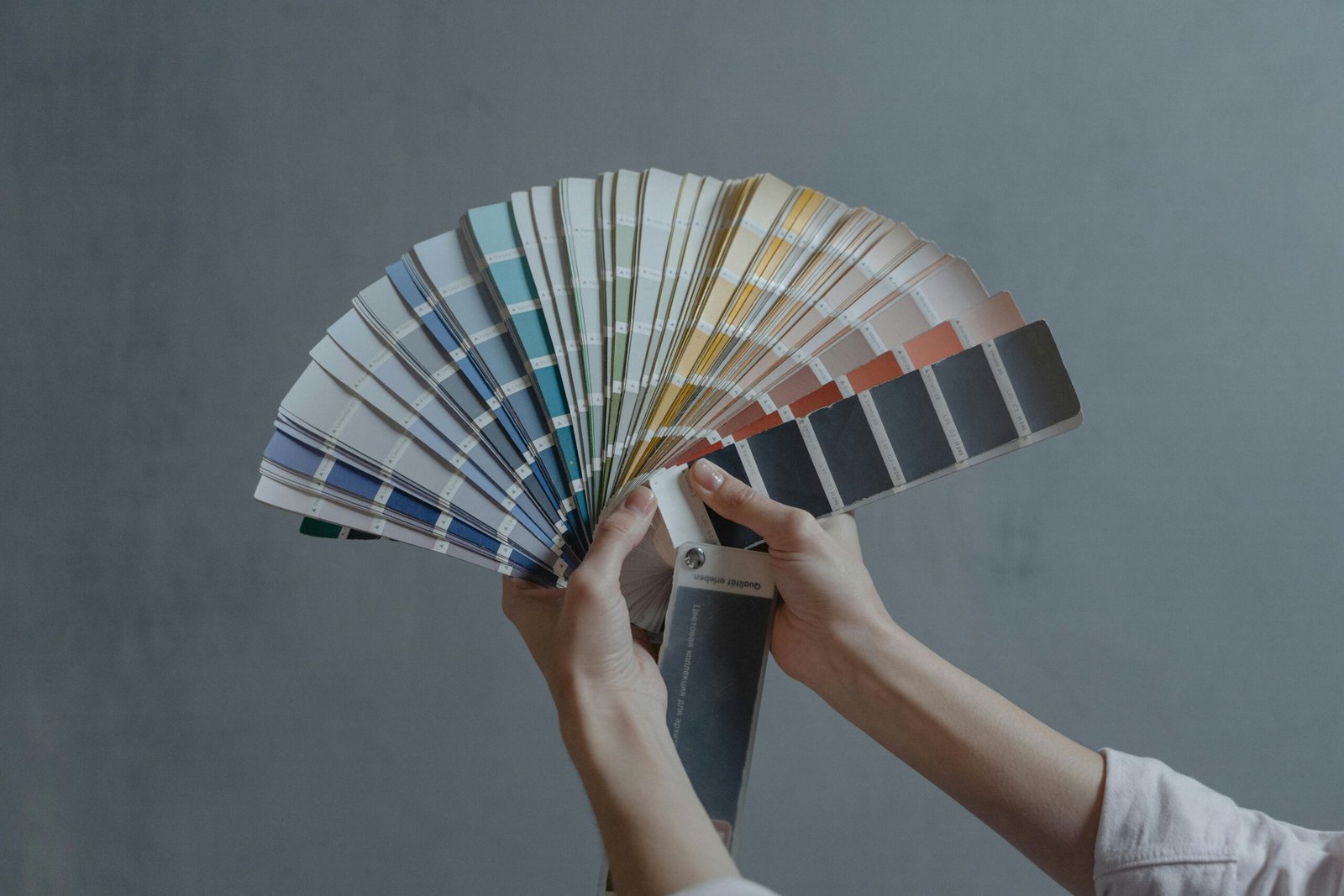

There’s a moment we don’t talk about enough: you walk into your home after a long day and instead of exhaling, your shoulders stay up by your ears. Nothing’s wrong—it just doesn’t feel calm. That’s where colour psychology in interior design quietly steps in. The shades around us influence how we rest, think, and reset, often without us realising. When used intentionally, colour can turn your home into a soft landing place rather than another source of noise.
In this Home Flow guide, I’m sharing light, visually led ways to use colour psychology in interior design to make your space feel more peaceful—without repainting your entire life or turning your home into a beige box.
Why Colour Affects How a Home Feels
Colour psychology looks at how different hues influence mood and behaviour. In homes, this matters because each room carries a purpose: rest, connection, focus, creativity. Colour psychology in interior design helps you match the feeling you want with the colours you see daily.
Soft Neutrals: Calm Without the Cold
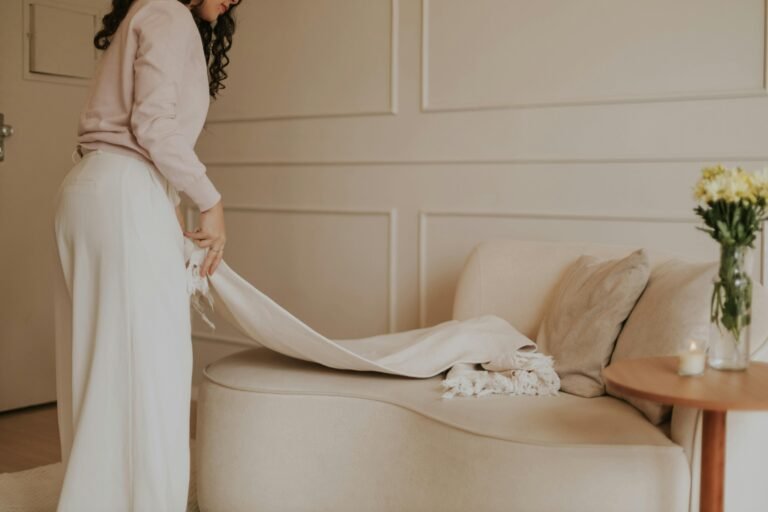
Neutrals get a bad rep for being boring, but soft neutrals are peace in colour form. Think warm whites, oat milk beige, greige, and light taupe. These tones reduce visual noise and create a gentle backdrop for everyday life.
Try this: Use soft neutrals on your largest surfaces (walls, rugs, curtains) to anchor the room.
Blue Tones for Emotional Exhale Spaces
Blue is known for lowering stress and slowing the nervous system. It’s ideal for bedrooms, bathrooms, and reading corners—anywhere you want your body to unclench.
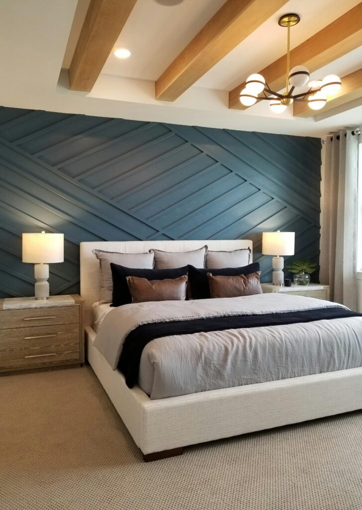
Try this: Add blue through bedding, ceramics, or a feature wall rather than committing everywhere.
Green for Balance and Grounding
Green connects us to nature, which is why it feels so grounding. It symbolises balance, growth, and restoration—perfect for shared living spaces or home offices.
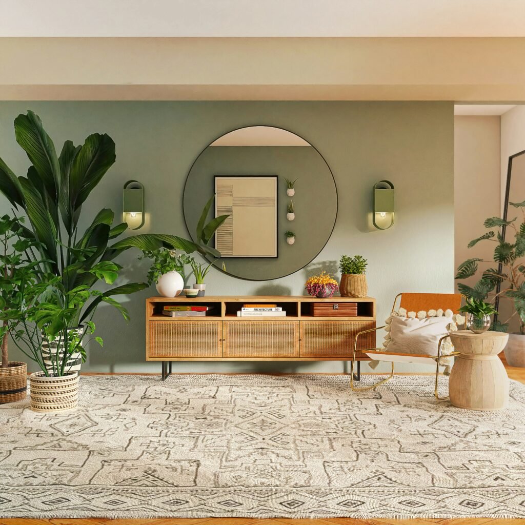
Try this: Incorporate green through painted cabinetry, wall art, or (bonus points) actual plants.
Warm Pastels for Gentle Joy
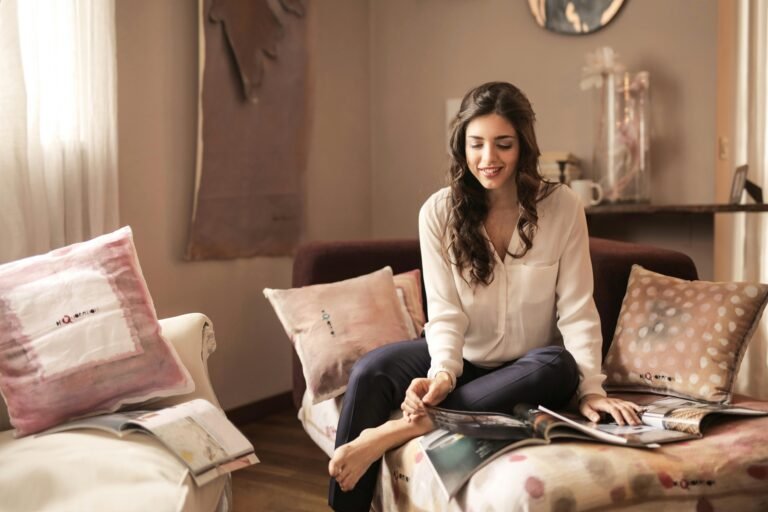
If neutrals feel too safe and brights feel too loud, warm pastels are your sweet spot. Blush, soft peach, lavender, and buttery yellow add emotional warmth without overstimulation.
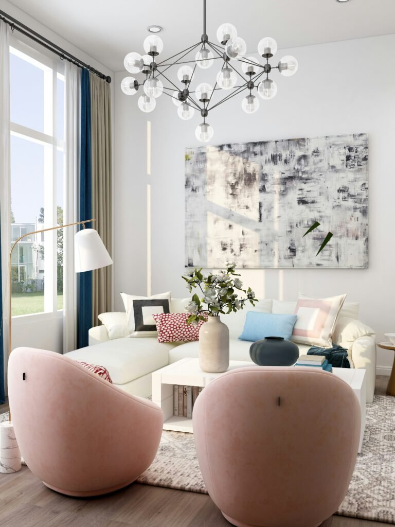
Try this: Introduce pastels through cushions, throws, or small furniture pieces you can easily switch out.
Earthy Accents for Visual Stability
Terracotta, clay, caramel, and soft browns ground a space and make it feel secure. These colours work well as accents rather than main shades, especially in modern homes.
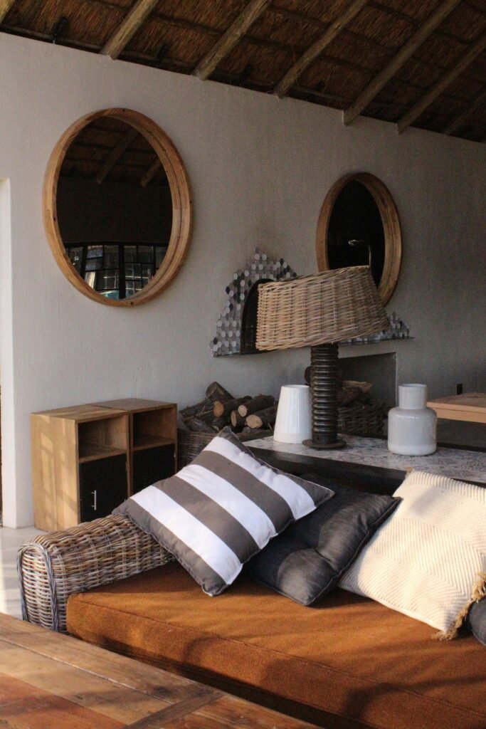
Try this: Think lampshades, vases, books, or wooden furniture rather than walls.
How to Choose Colours Without Overthinking It
A peaceful home doesn’t come from following rules—it comes from awareness. Before changing anything, ask:
- How do I want to feel in this room?
- Do I need energy or ease here?
- Does this colour help or overwhelm me?
Colour in interior design isn’t about perfection; it’s about intention. Start small, observe how you feel, and adjust gently.
Final Thoughts: Peace Is a Palette Choice
Your home should meet you where you are. By using colour psychology in interior design, you’re not just decorating—you’re curating emotional ease. Soft colours, thoughtful accents, and a little curiosity go a long way.
Try one small colour shift this week and notice how your space responds. And if this inspired you, read the rest of the blog for more Home Flow ideas designed to support soft, intentional living.